
Heavenly Swirls, renowned for its heavenly Nutella and flavor swirls, aspired to transition from home kitchens to supermarket shelves. Our mission was to craft an identity that not only stood out in the crowded supermarket landscape but also resonated with their values and discerning customers.
Our creative journey began with a deep dive into the supermarket realm. We meticulously studied packaging designs, color palettes, typography, and market trends to lay the foundation for our rebranding strategy. 


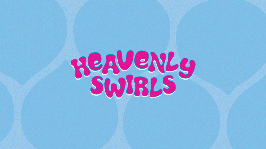
A bold color palette of brown, baby blue, fuschia, green, and orange exuded warmth and indulgence, enticing shoppers to experience Heavenly Swirls' delightful treats. Complementing this, a playful yet professional font captured the brand's joy. Mouthwatering flavor representations adorned the packages, inviting customers to explore the delightful world of Heavenly Swirls.
The reimagined brand identity, blending tradition with contemporary elements, featured bold colors and captivating flavor patterns. It encapsulated the essence of Heavenly Swirls, rooted in nostalgia yet poised to explore new horizons with a visually appealing, flavor-rich identity.

