
Atrio, derived from the Italian word 'Atrium,' echoes the concept of an open-spaced hall or public square—a gathering place akin to the functions of the lobby at the Hilton Hotel. The name itself, pronounced (a-tre-yoh), carries a melodic resonance that reflects the inviting and communal atmosphere Atrio aims to embody. This linguistic connection serves as a foundational element, infusing the brand with a cultural touch that enhances its identity within the hospitality context. The essence of an open, communal space becomes not just a name but a guiding principle for Atrio's brand narrative.
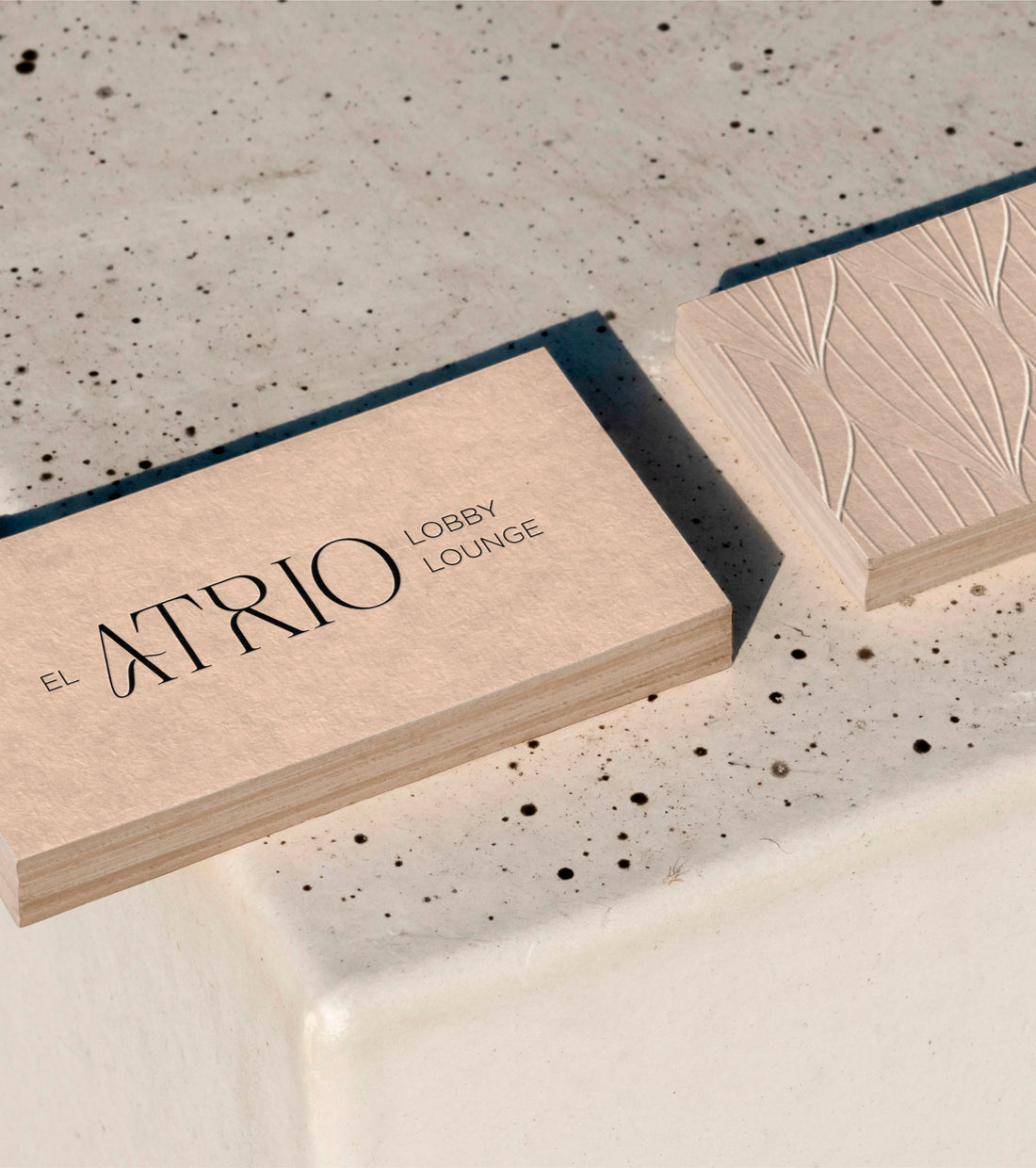
At the heart of Atrio's identity is its edgy serif font logo, featuring a subtle curve in the letter A for "el atrio." This design choice adds a touch of uniqueness and modernity, with the letter A doubling as an iconic element reinforcing the connection to the hotel's central space. Modern patterns complement the central logo, exuding contemporary style, while a carefully curated color palette of neutral shades ensures an elegant and timeless feel.
The branding reflects Atrio's commitment to capturing the essence of the space, transforming it into a timeless visual journey. Rooted in the concept of 'Modern Elegance,' the brand identity seamlessly blends contemporary design elements with a touch of timeless sophistication. This approach ensures that Atrio stands out in the competitive hospitality landscape, offering a warm and inviting atmosphere for all who visit.


